Color Sense, Color Blending, and Color Theory.
Life is full of color so imagine a world without it. For a majority of us, we would really miss the vibrancy and emotion that color offers. Painting would be a challenge. However, there are people who suffer from color blindness and become tremendous artists, evoking the same passion is if they were using color. Here is a pen and ink done by the artist Elmer Rising who was color blind.
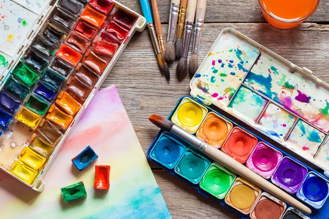
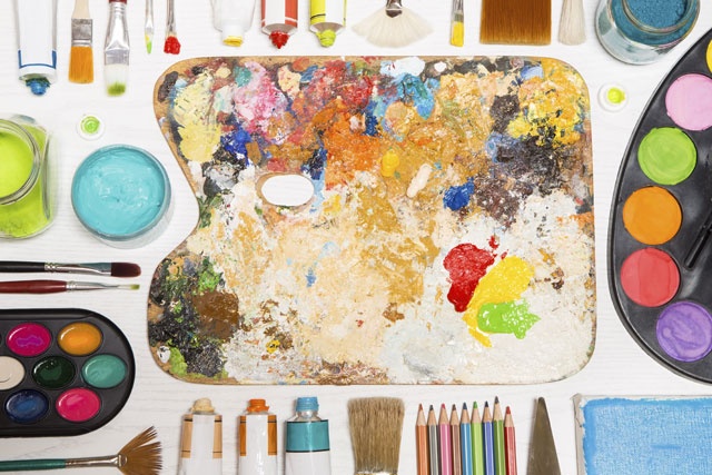
Now that you have paint, a brush, and have started painting, the next step is thinking about color. Color has tremendous power and you will find that it can become your best friend and might be the most enjoyable part of painting. To utilize what all these beautiful colors can do for you, it is important to understand about color. It will save you from hours of frustration trying to decide what colors to use and what colors blend well together. Despite what this article will teach you about color, do not throw out the power of intuition. Rely on your intuition about putting colors side-by-side and just go with it. It they feel right, they probably are right.
Now the first lesson on understanding color is to be patient with yourself. It takes time to comprehend the fundamentals of color fully. Practice, experiment, and be creative.,
COLOR BASICS
Let us talk about the color wheel. When you first look at it and see the colors moving in a clockwise direction, you will probably be reminded of the colors of the rainbow. Remember ROYGBIV? Red, orange, yellow, green, blue, indigo, and violet. The color wheel is an essential tool for understanding color and for times when you want to mix and combine color. You can make your own color wheel on paper or you can purchase color wheels from any art store.
PRIMARY COLORS
The primary colors are red, yellow, and blue. Look at where they are located on the wheel. They are equidistant apart. Primary colors are also called "true" colors because all other colors are created from these three colors. These colors cannot be broken down into anything simpler.
SECONDARY COLORS
When you mix two primary colors together, you create a new color called a secondary color. Red and yellow make orange, blue and yellow make green, and blue and red make violet. Look at where these colors are on the color wheel. Notice they are equidistant apart.
TERTIARY COLORS
Now look at the color wheel and see how we create the colors in-between the primary colors and the secondary colors. For example, if you combine red and violet, you get red-violet. If you mix blue with green, you get blue-green. And mixing yellow with orange gives you yellow-orange. These are called tertiary colors.
COMPLEMENTARY COLORS
Now look at the color wheel and see what two colors are opposite each other. For example, if you look at red, the exact opposite is green. These two colors are complementary colors and notice how well they contrast with each other. The combination makes each color pop. It is no wonder that these two colors are used at certain holiday times. If you go around the wheel, check out the complementary colors.
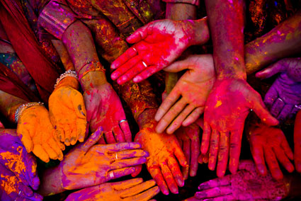
So how does the color wheel help you when you are painting? Let us say you wanted to paint a picture of a peach. A peach has that yellow-orange hue and when you look on the color wheel, look for the complementary color of yellow-orange and you will see it is blue-violet. So that blue-violet would make a wonderful color for a background and make the peach really pop. A yellow pepper would look amazing with a violet background. How about a green tomato with a red background. What others can you think of?
Find the complementary colors in this painting.
MONOCHROMATIC
Mono(one)chromatic painting is taking one color and using that color in various tones, shades, and tints. Just using one color can make for a very dramatic painting. What are the advantages of painting monochromatic? This style of painting is great for beginners because it helps the artist to see different values (lightness or darkness). Another advantage is that a monochromatic can be painted first and then color can be added. Many artists love to use the darker colors like black or brown to do a monochromatic but any color may be used.
TRIADIC
Look at the color wheel and find three colors that are evenly spaced around the wheel. For example, yellow, blue, and red are evenly spaced. You probably caught on very quickly that they were also the primary colors. Other combinations work just as well. When you use these three colors together, you will see that there is a tremendous contrast. However, despite the contrast, the colors blend beautifully. This is called a triadic(three) color scheme.
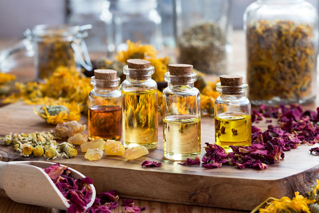
COLOR BLENDING WITH WATER AND OTHER MEDIUMS
We have spoken about using water to thin acrylics. Water is good medium for creating a watercolor effect and helping to blend colors together. In addition, other blending mediums out there on the market do the same thing and here is a brief overview of some of them.
GLOSSY AND MATTE MEDIUMS
Glossy medium will thin your paint, and if you use enough, the paint will turn transparent and allow the colors underneath to come through. When the gloss dries, it gives a wonderful shiny finish. Matte medium works the exact same way but when it dries you will see a satiny finish and there will be no shine. One is not better than the other. It is simply a matter of preference.
GEL MEDIUM
Gel medium comes in a tube and is very thick, sort of like the consistency of hair gel. When it is squeezed out of the tube, it looks murky but it will dry perfectly clear. Gel medium can be blended with paint and the result is this lovely thick paint that is perfect for creating heavy texture and perfect for using a palette knife.
MODELING PASTE
This medium comes in a can or jars and is even thicker than gel. It is almost as thick as clay and allows the artist to create paint on your canvas up to a half-inch high. There is no problem combining your paint with modeling paste, but work one layer at a time, allowing each layer to dry before adding the next to avoid breakage.
RETARDERS
Retarders slow down the drying time of acrylic paint. Just add a dollop to your paint and you extend your painting time significantly. It is possible to combine these mediums to create your own style of medium. Gloss and matte are liquids and the other are solids so you can also create different consistencies. For example, it you mixed some gloss and matte medium, it would result in a semi-gloss finish. It is also possible to mix gel with a matte finish and this results in a semi-liquid consistency. There are many options.
Acrylic paints have an amazing set of characteristics one of which includes versatility. Think about all the options that are available with acrylic paint.
-
Painting directly from the tube.
- Thinned down with water.
- Painting on wet paper or canvas.
- Add mediums to the paint.
- Using a variety of brushes.
- Using tools other than brushes.
- Painting on just about any surface.
Let us discuss some of the methods that can be used for painting.
DRY ON DRY
This simply means that you are using the paint directly from the tube or jar and not adding any medium to the paint. Apply your brush full of paint directly to dry paper or dry canvas. Dry on dry also means you can add more paint on top of dry paint, a layering technique. Using a blow dryer between layers is fine. Remember, always paint dark colors to light colors when using acrylics. There is something else that you can do that is related to the dry on dry technique. It is called a dry brush technique.
1. Load your brush with paint.
2. Wipe off some of the paint on a paper towel.
3. Paint some of your painting.
4. Wipe off a bit more of the paint on a paper towel.
5. Continue painting.
6. Soon you will think that you do not have enough paint on your brush.
7. Keep on painting anyway.
8. This technique leaves a lot of white spaces between the colors. That's the effect you want.
WET ON DRY
For this technique, you can add water or other mediums to the paint before loading the paint on your brush. Then paint again on dry paper or dry canvas. The result is either a thinner or a thicker paint depending on which medium you choose.
WET ON WET
If you have ever painted with watercolors, this is a fun technique. Using either a wet paintbrush or spray bottle, wet a portion of your paper or canvas. Then paint directly onto the wet section of your paper or canvas. Do not wet the entire paper, as it will dry in the areas where you are not working. Be aware the paint will move around quite a bit. Let it dry before moving on so all the colors do not run together. Wet on wet also means painting wet paint onto wet paint. Be sure to use a thinner coat on the bottom of your canvas when doing this. Wet on wet allows the artist to blend colors so nicely and create soft edges. A flat, round, or filbert brush works well here.
- Palette knives have many purposes. They can be used for mixing paints on your palette instead of using your paintbrushes. Mixing paint with your brushes really ruins your brushes quite quickly. Another option to mix paint on your palette is using Popsicle sticks. A palette knife can also be used to scrape paint off your painting. A palette knife is a very effective painting tool. They are soft, flexible knives and designed to pick up paint to make broad strokes or thin lines. The tip of the knife can add small dabs of color. The painting below has thin lines made with a palette knife.
- Sponges are so much fun to use. Any kind of sponge will work but for terrific results try using sea sponges. Some tips on using sponges are to keep your sponge moist at all times, use different sponges for different colors, and use the flat side and the edges for different looks. For less thick paint, dab the sponge on a paper towel after dipping the sponge in the paint. Small sink sponges work well, and try the wet on wet technique for an interesting sponge texture. When you get a sponge, cut it into several pieces so you can use a multitude of colors.
- A brush we have not discussed is called a bristle brush. This synthetically made brush has short, stiff bristles and can carry more paint than a flat brush. It is a useful brush for applying thick color and can create a unique texture.
Bristle brush
GLAZING AND SCUMBLING By using a variety of brushes and the tools mentioned above, there is a way to create an amazing depth and richness to a painting. The first way is glazing. Glazing is applying layer after layer of thin paint on top of each other. It can be done as you paint or when you have completed the painting. Be sure to use lighter colors than what is on your canvas and use very thin paint. I cannot emphasize this enough. When you glaze, your painting will come to life and improve the light. You could glaze with water, or glaze with some thin paint and a gloss. There are all kinds of possibilities. Glazing can actually save a painting! In addition, glazing is useful for correcting the value or intensity of the colors on your painting. Make sure you let each layer dry before adding another layer. A blow dryer is quite helpful during this process.
This is an interesting technique. Beginning artists may have not heard of this before. Basically, you just add one thin layer of paint over another in a very light way so that the colors underneath show through. You could use dark over light or light over dark. It may sound like sponge painting, but when you do scumbling with a paint brush, it gives a completely different effect. Scumbling can be an effective method for reducing some glaring bright colors or for creating a hazy, smoky appearance.An example of Scumbling Claude Monet ,
(Impression, Sunrise), 1872, oil on canvas, 18.90 - 24.